Friday, December 12, 2008

Mizzou Shooting Team

This is my OTHER final project for my Electronic Photojournalism class. It's constructed entirely using flash. It is a work in progress to always work out the bugs and such, but its pretty complete as is. Enjoy. 

http://web.missouri.edu/~jdlp68/mushooting/shootingteam.html


Anachronism: Right place, wrong time

So my advanced techniques of photojournalism class comes to a close with a group final project. We stumbled upon this event through a friend of one of the group members. We all contributed with photos, sound, and production to produce what we think is relatively awesome project. Enjoy.


Hit the full screen button to view it larger and better quality.

Harvard v. Yale 2008

I got the opportunity to go to the Harvard v. Yale football game. It is one of, it not the oldest college sports rivalry in the United States. It's a huge event for both schools. Each school trades off every year hosting the game and this year it was at Harvard. It's a long way going from Big 12 football like Mizzou to ivy league Harvard and Yale but I enjoyed what little we saw. The wind brought the windchill factor down to roughly 10 degrees. Harvard's stadium is entirely cement, so sitting down literally sucked any heat you had right through your back end. We departed at the half to go warm up. Harvard defeated Yale 10-0 in the 125th meeting of the two teams.


Photo © Jason Lenhart

Photo © Jason Lenhart

Thursday, December 11, 2008

Multiple Flash

This is a photo from my group's final project event. It shows relatively good use of multiple flash technique. With the help of Clare Becker and two handheld strobes, I was able to pop light from two different angles, making what you see here. I used a nikon SB800 TTL'd to the camera in my hand, while Clare had an SB900 set to fire off the flash from the SB800. Worked pretty well. You can see more photos from our project in a post soon to come. 

Photo © Jason Lenhart

Monday, December 1, 2008

Audio Slideshow

Photographer Robbie Cooper has just put out a very interesting video piece for the New York Times. You can check it out here.
 
I think this piece is a very different piece than we normally see. It sorta comes off the controversial CPOY winner, kids with guns. It's just another way to present an issue. Kids with Guns looked at the gun culture in america, this piece looks at our video game culture. Both present it in a very unique way. Cooper used a "red camera", a super hi resolution camera, and was able to make some amazing emotional portraits from frame graphs. I think it does a great job at looking at a different aspect of what is a largely discussed issue, and that is video games in society. Most times, it is debating whether or not they are violent, or lead to violent tendencies among kids. Cooper shows us just how focused and involved kids can be with video games and stays away from the violent debate.

Sunday, November 16, 2008

Mizzou Soccer v. Illinois

I got the opportunity to shoot some soccer on sunday. It was the first round of the NCAA women's soccer tournament. Mizzou defeated Evansville is the first game of the first round. After that was the fighting Illini (still not sure what an Illini is). The game ended up going to a roughly 6 player deep shootout. Mizzou was defeated.


Photo © Jason Lenhart


Photo © Jason Lenhart


Photo © Jason Lenhart

Thursday, November 13, 2008

Fill/Balance

Our next assignment, amidst the craziness that is CPOY, was our Fill/Balance assignment. Fill uses our handheld flashes to fill in the shadows. Rita uses a great example. If you had to photograph the shootout at the OK Corral, all you would get would be cowboy with shadowy faces. Their hats black out any light. We can fix that by popping some flash in there, emphasis on some. Too much looks bad, makes the photo flat and the lighting ratio is not believable. Turning down the flash makes a better photo.
The other part of the assignment is balance. This is where we balance the light inside, with the light outside. Often, when you see picture that are taken inside a dark place, anything outside, through any windows in the frame, is incredibly blown out. You expose for the inside, which is way to low for the light outside, so you loose any detail out the window (assuming you want what's out there. Blowing out the windows is a widely used technique, it can be very dramatic). You can fix that by exposing for the window light, and then using your flash to bring the inside to within a reasonable lighting ratio. Below is an example. While not the best, due my running around all crazy, and having overcast "soft-box days". The lighting ratio was not to drastic to begin with, but you can see that the inside, and out, are exposed near correct.

Photo © Jason Lenhart

Flash Project

This is my flash project from my Electronic Photojournalism class. We learn a lot about building websites and using tools, like flash, to create multimedia piece. I took this as an opportunity to call some photos that were rotting in my archives to action. The overall flash is a little cliché, but I like it for my first flash project.

http://web.missouri.edu/~jdlp68/nazimarch.html

Thursday, November 6, 2008

Painting With Light

So this is the real assignment, not the class lab. Kat Oriez, Jakob Berr, Christine Martinez, and I all worked collectively to create these two photos. They are not composites or multiple exposure, but one continuos long exposure in which we literally "painted with light". It is/was one of the more enjoyable, artistically creative assignments we have done yet. The possibilities are endless.

Photo © Lenhart, Oriez, Berr, Martinez

Photo © Lenhart, Berr, Martinez

Wednesday, November 5, 2008

Painting with light lab

These are the photos from our awesome lab. It may have been near freezing out, but we still had a good time cooking up dogs and then painting this little shack with light. Special thanks to all the painters who froze their asses off for the rest of us to get some photos.

Photo © Jason Lenhart

Photo © Jason Lenhart

That last photo was Phoebe's attempt to write out "ADV Fall 08" and then draw a camera.... the camera is pretty sweet no?

Wednesday, October 29, 2008

Color Correction

Another assignment, right on the back of the single flash one, and just as tricky. In this assignment we learned to balance the color of lights when we use flash. I'll explain. All lights (yes, ALL) have different color temperatures. We don't usually notice, because our brains are adept to adjusting to that. We see something white, and under most circumstances, we recognize it as white. But have you ever been in a room that is just lit really weird, with bad lights, and you can recognize that everything is "kinda orange" or "a little green"? Well, our cameras always see the color that way. It is up to us to adjust for these different color lights using White Balance. White balance basically tells the camera "This is white" and makes it adjust accordingly. We have presets on the camera that will adjust to incandescent, fluorescent, daylight, shade, flash, cloudy, and sometimes more. Many cameras also have an AUTO and Custom (or PRE). In this assignment we focus on the Custom White balance because we are dealing with two lights.
When you bring flash into the scenario, most flashes are daylight balanced, and therefore the "flash" or "daylight" white balance would suffice. But what if you are shooting flash in a room lit by ugly green fluorescents? If you pop flash under the daylight white balance, the subject flashed will be correct colors, but anything lit by the fluorescents, like the background, will be green. We can fix this by using gels on our flashes. A gel is a thin, color piece of transparency that goes over the light, making it that color. So when we are shooting flash in a fluorescent room, we put a green gel over the flash to make all the lights in our photo relatively the same color. That way, in the camera, we can do a custom white balance and EVERYTHING (in theory) should be correctly balanced. Make sense? Well, it's a bit more simple that the actual practice of it. Many lights, especially now with CFLs,  are not what we perceive. Fluorescents could be warmer and therefore balanced more like an incandescent. Sometimes they are still the same color, but a warmer or cooler, so a warmer or cooler shade of gel would be required to make it perfect. Getting it perfect is very tricky, but getting all the lights the same color to the best of your immediate ability, is better than nothing. The following photos are two examples. The first shot is made under fluorescents with the daylight balance and no flash. Ugly. The second is made with flash, but the flash is not gelled. Finally, The third is shot under the same fluorescents. While still green under daylight balance, a lighter green gel should have been used, rather than the darker that I used. If you look on the wall behind the girl, you can see the lights on the wall are a semi-pink. They are not balanced perfectly, but better than the previous two shots, no?
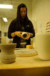
Photo © Jason Lenhart
Notice the terrible green tone. This is what fluorescent looks to our cameras.
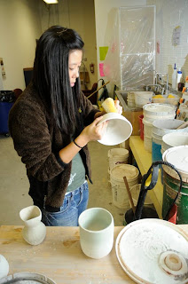

Photo © Jason Lenhart
Now, in this one, some items in the photo appear to be white. This is flash under daylight. Since many flashes are balanced for daylight, the camera is OK with this. If you look at the background, you can still pick up the green tint. This is from the Fluorescents.
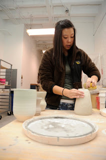


Photo © Jason Lenhart
Here we have the green gel and a custom white balance. Everything, for the most part, looks in balance. You can see the slight pink tones in the background near the lights. I'm not absolutely sure why that happens, but it may be that my gel was too powerful for these lights. Overall, its a much better photo that the other two.

These next two are the before and afters. They are balanced using orange gels under fluorescents acting as incandescent.


Photo © Jason Lenhart
Incandescent + daylight white balance + no flash = Ew


Photo © Jason Lenhart
Flash gelled orange and a much better white balance = better looking photos.

Monday, October 27, 2008

Single Flash

Ok, so flash isn't very pretty for the most part, especially when you've never really worked with one before. For this assignment, we were to go out into the world (right as we got comfy in the studio) and shoot some real "journalistic" stuff. I still struggle coming up with my own things to shoot. It's a skill I have yet to fully develop I guess. Anyway, the assignment was simple. One take shooting an off-camera flash directly at your subject, and one take shooting the much better looking bounce flash. This first shot is a man by the name of Alan Young. He works over at the repair center of Joes Machens Toyota, where I bought my Corolla. He's been chugging away at vehicle repair for 28 years now. This is my attempt to blind Alan.


Photo © Jason Lenhart

Ugh, not so pretty eh? Yea, direct flash has that effect. The next photo is bounce flash. Moral of the story... use bounce flash, it's a lot nicer and you're less likely to blind people. This is the hilarious "Comedy Wars" Improve group that performs every wednesday in Memorial Union. I highly recommend them to beat the "hump day" blues.


Photo © Jason Lenhart

That's single flash. Come back next week to see my sad attempt at color correcting for flash with gels. So far so fail.

Thursday, October 16, 2008

Metal & Glass


Photo © Jason Lenhart

This assignment was another studio assignment and of course right as we get comfortable with the studio, it's our last one. From here on out the photos from this class will be "out there". Anyway, this assignment is aptly titled "Metal & Glass". Why photograph metal and glass? Well, because they are extremely difficult to photograph in the studio. Metal is completely reflective, so unless you're camera sees this reflection, you won't see the metal. Glass, on the other hand, reflects no light, so you have to use two techniques to light Glass. Black line lighting, or white line lighting. Black line lighting means you light the background behind the glass. This gives the edges a "black outline" so to speak. White line lighting requires lights on the immediate sides of the glass object. With a dark background, this gives the edges of your glass and "white outline". With white line you may have to light the top and/or bottom to give the glass definition. Unfortunately I don't have any examples of glass. We shot this assignment with partners and my partner, Anne, got glass so you'll get to see metal.
Like I said, in order to photograph metal your camera needs to be within the group of angles the light creates when it reflects off the metal, otherwise you'll just get a black piece of nothing. Not sure how I came up with the idea for this assignment, but it worked out pretty well. Not perfect but sufficient. No, its not a real pistol (it's a BB gun), yes that is real ammunition, and Incense is how I created the smoke. The modeling lights had to be turned off for periods of time because they were beginning to heat the area up significantly. I'd rather not  have to explain why there are large holes in the ventilation in the studio.

Sunday, September 28, 2008

Classmate Portrait


Photo © Jason lenhart


Our next assignment was to create a studio portrait of a classmate. We drew names out of a stylish hat to see who would photograph who. This is Trevor Buehler. He hails from the suburban life of Akron, Ohio. The point of this assignment was to familiarize ourselves with studio lighting. It's a bit tricky to figure out at first but after that the technicalities of it are rather simple. During two of our labs we spent time first learning about the power boxes and how to safely and correctly assemble those and second, learned some studio set-ups. The assignment was to produce two photos, one with a single light source, and another with as many lights as we choose. The studio has several strobe heads, reflectors, soft boxes, etc. etc. so we had LOTS to choose from. The photo above is made with two soft boxes to the immediate right and left of Trevor. There is a silver reflector on the floor angled up at him. One strobe is obviously set higher than the other giving the lighter, and respectively darker, sides of his face. The photo below is a single light source coming from his left at a roughly 45 degree angle and raised up a tiny bit. It produces a "Rembrandt" lighting scenario, giving him that triangle on his face like many of Rembrandt's paintings. 


Photo © Jason Lenhart

The entire assignment went over really well. The PhotoJ studio only has one problem - It's gremlins. If any part of your body is touching the floor like you're knee or a toe, the strobes won't fire. It must have something to do with some faulty wiring in the room. Makes for some interesting troubleshooting. You'll double and triple check all your wiring and stuff when the strobes won't fire only to figure out there is a hole in the bottom of your sandals and your foot is touching the floor. 

Sunday, August 31, 2008

Copy Test

So this assignment was to literally photograph a photograph. Apparently having the ability to successfully copy items can get you a $35,000 freelance job - or so i've been told. Basically using a system of lights you cancel out any glare and produce a nice copy of the photograph. It's often used to copy pieces of artwork for publication purposes. User beware; make sure you credit the photographer. It's a valuable skill but a dangerous one. Don't steal. Anyway, our assignment was to find two photos to copy. One was to be a photo in which the lighting really adds to the mood or overall feeling of the photograph. I chose a photograph by Ashley Gilbertson. Photographer and author of a great photographic chronicle of the Iraq war called "Whiskey Tango Foxtrot". You'll have to read it to figure out what that means. 


Photo © Ashley Gilbertson from Whiskey Tango Foxtrot
It's an amazing book with even more amazing photographs like this one. I wanted a different photograph but it was flush with the binding of the book so there was a glare (couldn't flatten the book well enough without ruining it). This is my second choice. The lighting, probably sunrise or sunset, gives it sort of a peacefulness among rugged, war hardened situations. Any other lighting situation would not have made this photo as great.
This second photograph is for the "Stump-the-Chump" assignment. The great Rita Reed is supposed to be able to tell us exactly how these photos were created. I pulled one from my "100 Photographs That Changed the World" by LIFE. It's a photograph taken by Harold Edgerton in 1931 titled "Milkdrop Coronet".  It's visually stunning and was probably shot with multiple light sources. I'll let you try and decide.


Photo by Harold Edgerton ©Harold & Esther Edgerton Foundation 

Wednesday, August 27, 2008

First Entry

This is my first entry into the world of blogging. The first few months of this blog will be devoted to maintaining a photo diary for my Advanced Techniques class at the University of Missouri's Journalism School. Photos will be uploaded; all of which are my copyrighted work unless otherwise noted. Any attempt to steal them is wrong, so don't do it. Alongside the photos will be commentary, critiques, etc. etc. as required for my class. As the semester progressing my own website will be under construction due to yet another awesome Journalism class called Electronic Photojournalism. Hopefully there will be links posted to and from my website.